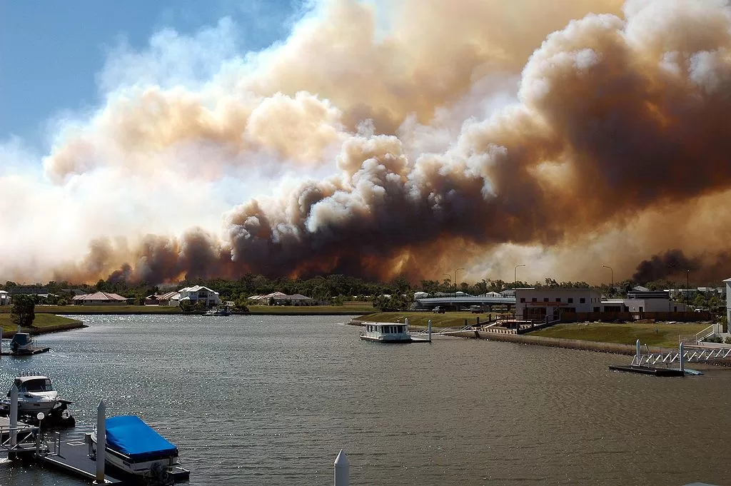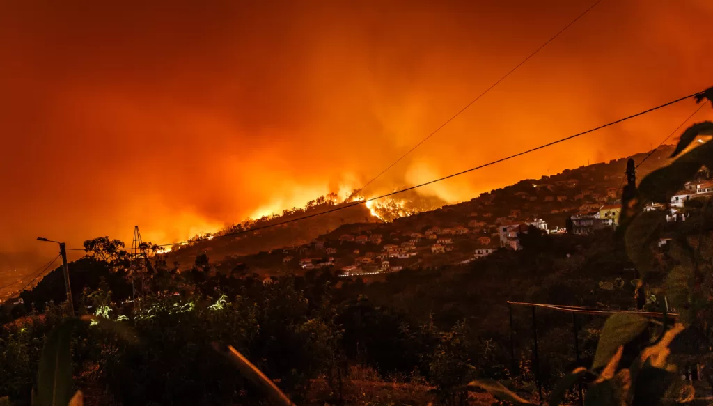
Australia's bushfire season is upon us. 360info has collated data from every state and territory which shows the fire risk to every suburb in every region.
Australia’s bushfire season is upon us. 360info has collated data from every state and territory which shows the fire risk to every suburb in every region.
The following interactive maps show how prone each suburb in Australia is to bushfire.
You can share and embed these maps by using the gold share button on each map. Scroll to the bottom of this article for more information about how the data is collated.
New South Wales
Victoria
Queensland
South Australia
Tasmania
Western Australia
Australian Capital Territory
Northern Territory
State and territory governments use maps of bushfire risk areas to increase bushfire resilience and to ensure that homes built can withstand bushfire attack.
Every government defines these risk areas slightly differently. In the following map, the suburbs in brown have a high percentage of areas that are deemed at risk of a bushfire, while yellow ones only have a small percentage (or none at all).
Not having areas deemed at risk doesn’t mean that a bushfire is impossible, just that there is less risk.
Originally published under Creative Commons by 360info™.
Enjoy this article?
Sign up for our fortnightly newsletter
Are you a journalist?
Sign up for our wire service